Tuesday, February 24, 2009
Photoshop Tutorial Gone Askew
I chose one of the PSDTUT tutorials - create a portrait from a photograph. Following the steps were easy. The effort of creating a detailed portrait using only a touch pad was a pandora's box of its own. I worked blood, sweat and tears into my portrait, yet somehow the resulting image bears striking similarity to Tina Turner if she went through the same surgical procedures as Michael Jackson. Needless to say, i was devastated with this result, unless I have unaware been living as a caucasian double of Tina Turner for the past twenty years. Focusing on words of advice i'd give to future makers of look-alike celebrity portraits: make sure you go very very close to the area you are working on. I made the mistake repeatedly of working too far back from the canvas, thus missing opportunities for necessary details. I would also suggest working with a photograph that has defined edges in the eyes, mouth, and nose. I found it difficult to work from the photograph I chose because firstly it was angled, and secondly it was not contrasted enough to allow me to see where to shade etc... Since this was my first time attempting the tutorial, it's likely that you might even need to have a similar experience to mine to get to the next point of being able to create a flawless tutorial image like the one PSDTUT made. I do think this tutorial was fun to work with, but it was time consuming, especially on the week when I have four upcoming midterms and a paper due along with the typical work that comes with the week. Next, I want to create the tutorial image PSDTUT - Create a Sleek Illustration that Fades from Line Art to Color: it'll be necessary to have sufficient time to work on it considering that it is 28 pages worth of instruction and probably about 5 or 6 hours of hard-working time in photoshop.
Sunday, February 22, 2009
Monday, February 16, 2009
Site Templates


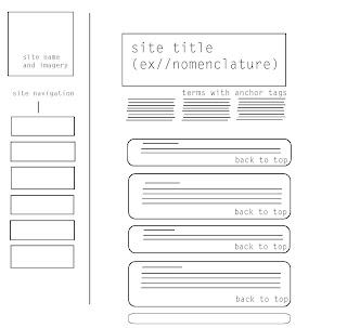
Here are the three initial templates that I have created for my Web Design Field Guide titled "Web Design Pie." A few things to note: 1) The third page that is orange is a pop up window, thus doesn't need a home navigation. Also, on that page are three links listed. When created in Dreamweaver, they will not be listed as the entire site, but rather the sites name and will be linked. Otherwise, have at it with some crittage (slang for critique, of course)
Friday, February 13, 2009
Tuesday, February 10, 2009
#82 >> It's all about the texture
Texture of a photoshop document that can be partially visible in a document through layers is a technique I decided to focus on to learn from a specialty magazine focusing on photoshop craft and practice. Within the texture tip reads that in order to create the texture, you must first create a new layer, press Shift-Delete, choose 50% Gray from the Use menu, and then click OK. Once you've whipped this up, you take it layer into the filer gallery to apply the texture and change the layers blend mode to Overlay or Soft Light. You put this on a separate layer so that if you become so inclined and decide to have the painting printed on canvas, you can turn off this little application.
Tip courtesy of Lisa Sage
Below are examples of images created using this photoshop technique::: they're free!!
Monday, February 9, 2009
Sunday, February 8, 2009
Wednesday, February 4, 2009
Sites to Accompany the Connotative Words
These sites are visionary to my three conceptual words for the site. The Spring Loops site captures my approach of cleanliness and clarity, Squawk Design brings in the illustrative and innovative effects I desire, and I Love Typography prioritizes the information yet harmonizes the world of the written word and the aesthetic image to create a well-designed site.
Spring Loops
Squawk Design
I Love Typography
Spring Loops
Squawk Design
I Love Typography
Tuesday, February 3, 2009
Connotative Words
Illuminating. Inventive. Esthetic.
The three words I chose are faceted, yet are perfect in my emotive direction with the site thus far.
Illuminating : it is a site that people can use to become better informed and perhaps more accurately directed in web design.
Inventive : the site is not like any of the competitors and gives a new yet understandable way of looking at web design, even in the simplest form of definitions.
Esthetic : my role as a designer is to create not only something functional, but also inspirational and enlightening to the senses.
Sunday, February 1, 2009
Wireframing could potentially be addictive
Poof! Epiphany. Wireframes = easier web design. Thanks Denielle for yet again showing me the light, in the world of design of course. I am thankful ten fold for a renewed process in my web design. Now all is well in the world once again.
Subscribe to:
Posts (Atom)


